![]() The Yocto-Visualization application which enables you to easily visualize the data coming from Yoctopuce sensors wasn't implemented in a day. It's main development spread over more than two years. This is why the information about it is somewhat scattered around this blog. This week, we decided to gather all the pieces of information into a post. If you have never used Yocto-Visualization before, you can find here everything you need to know. If you have already used it, take the time to browse through this post, you may have missed some interesting details.
The Yocto-Visualization application which enables you to easily visualize the data coming from Yoctopuce sensors wasn't implemented in a day. It's main development spread over more than two years. This is why the information about it is somewhat scattered around this blog. This week, we decided to gather all the pieces of information into a post. If you have never used Yocto-Visualization before, you can find here everything you need to know. If you have already used it, take the time to browse through this post, you may have missed some interesting details.
The aim of Yocto-Visualization
Ordinarily, Yoctopuce sells USB modules and provides programming libraries to exploit these modules: it's up to the users to program the applications that will solve their problems thanks to Yoctopuce modules. However, confronted to pressing requests for a solution allowing customers to easily display the data coming from our sensors, we ended up agreeing to bend our own rules and to develop a dedicated application: Yocto-Visualization.
Main characteristics
The main scenario that Yocto-Visualization targets is the monitoring of an experiment based on Yoctopuce modules.
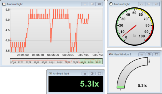
Yocto-Visualization
The idea behind Yocto-Visualization is to display the data of Yoctopuce sensors in real time and in different shapes: graphs, analog and digital gauges, while allowing for an extreme customization of the widgets. Yocto-Visualization can work with all the Yoctopuce sensors, whether directly connected in USB or available through the network thanks to YoctoHubs. Each widget has its own independent window. These windows are persistent: if you close the application and then re-open it again later, all the windows are restored to their last state.
Installation
You can download Yocto-Visualization directly from our web site "tools" page. It is available for Windows, Linux, and MacOS.
Windows
The Windows version is available as a simple MSI file. You only need to download it and to run it. The installation is very trivial: there is no exotic option. When the installation is done, you can access the application in the "Yoctopuce" sub-menu of Windows' "Start" menu.
Linux
Under Linux, you can either download an installer in the .deb format, or use apt-get to install it. When the installation is done, Yocto-Visualization is available in the "accessories" category of the main menu.
Be aware, the Linux version of Yocto-Visualization is based on Mono, you must therefore install it if not already done. Here is the command for installing Mono, make sure you install the "mono-complete" flavor.
$ sudo apt-get install mono-complete
Moreover, if you want Yocto-Visualization to be able to access the modules which are connected directly by USB in "user" mode, that is without specific privileges, you must create the specific udev rule.
MacOS
Yocto-Visualization is also available for some versions of MacOS. This version also uses Mono, which must be installed. Note, the windowing library of Mono is based on Appple libraries available in 32 bits only. Unfortunately, Apple operating system from Catalina onward stopped 32bit support. Thus, Yocto-Visualization doesn't work on Catalina. At the time of writing, there is no solution for this problem.
Global configuration
When you run Yocto-Visualization for the first time, you obtain a welcome window.
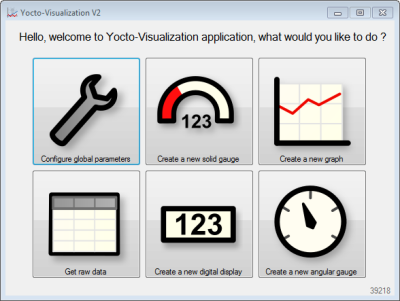
The welcome window
The first thing that you must do is to configure the way in which Yocto-Visualization accesses Yoctopuce modules. To do so, click on the "Configure global parameters" button so that the configuration window pops up. This window has several tabs, but the main one is "USB / Network".
Connection
The "USB / Network" tab allows you to define how Yocto-Visualization accesses Yoctopuce modules.
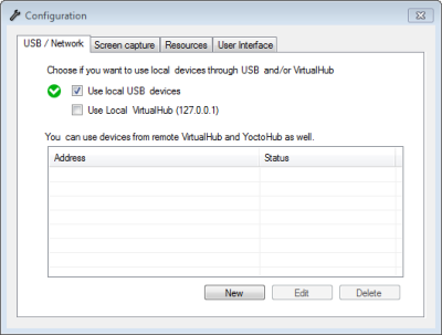
USB-network configuration
By default, only the modules connected directly by USB are used, but you can choose to use a VirtualHub which would run locally. Note, however, that Yocto-Visualization suffers from the same technical limitation as all other applications based on the Yoctopuce API. There can be only one application at a time accessing Yoctopuce modules natively. Typically, the VirtualHub is an application using the native mode.

Limitation of the Yoctopuce API
If the options "USB" and "VirtualHub" are both selected, Yocto-Visualization automatically uses the working one. Note that if you use a VirtualHub to access local modules, and that you decide to stop it, Yocto-Visualization doesn't automatically switch back to the local USB mode, even if this option is selected. You must either restart the application, or disable and enable the "use local USB devices" option again.
You can also add the addresses of YoctoHubs for which you want Yocto-Visualization to have access. Simply click on the "new" button and enter the IP address of the corresponding hub. The only compulsory parameter is this IP address, the other parameters are purely optional.
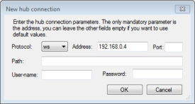
Adding a new hub
When you have added the hub, you can see it with its name and its connection state in the list of used hubs.

List of used hubs
Note that you don't have to use a physical YoctoHub, you can also enter the IP address of a VirtualHub running on a remote machine. You can add as many YoctoHubs as you want. When you are done properly configuring Yocto-Visualization, it's time to get down to business.
Graphs
The main interest of Yocto-Visualization is to draw graphs in real time. Simply click on the "create new graph" button in the welcome window. You obtain a new window containing an empty graph that you must configure. To do so, right-click in the window and select "Configure this graph"
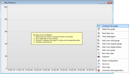
Configuring a graph
This displays the graph property editor. Each modification is applied in real time. All the properties are initialized by default to values deemed reasonable for most applications. The only property which can't be automatically defined is the source of the data that you want to display. So, you must select in "Data Sources / Series xxx" one or several sensors that you want to use. This parameter is a drop-down containing a list of all the sensors known by Yocto-Visualization.
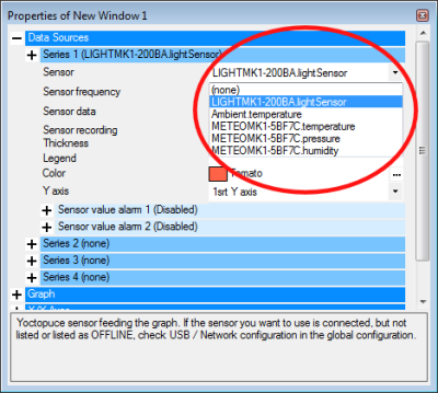
Select the sensor to be displayed
The sensors are listed with their logical name and that of their module if they are defined, otherwise the list uses serial numbers and hardware names.
If in the list a sensor is tagged as "OFFLINE", it means that at one time or another Yocto-Visualization saw the sensor but that it doesn't currently see it, either because it was disconnected, or because the method used to access it isn't available anymore. If the sensor you are interested in is tagged as "OFFLINE" and if you are sure that the module is connected, check the USB / Network configuration. You can also find details in the logs. If a sensor is tagged as "READ-ONLY", it means that this sensor is connected to a YoctoHub which doesn't authorize write access, and therefore any modification of the parameters linked to the module is forbidden. You can obtain write access to a protected YoctoHub by specifying the hub password when registering it in the global configuration of Yocto-Visualization.
When you have selected a sensor, the graph automatically starts plotting the values of the sensor.
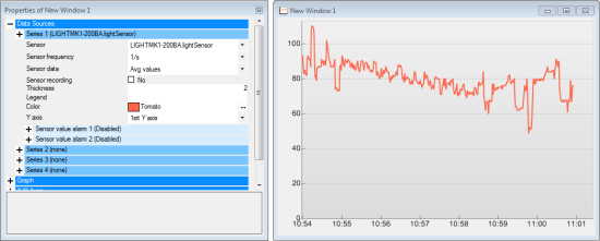
The graph starts to work as soon as a sensor is selected in the property editor
You can plot up to four lines per graph. You can move in the graph by moving its content with the mouse, you can zoom with the mouse wheel. By default the scales are automatic, but you can configure them in the "X/Y axes" section.
Other properties of each datasource
On top of the source per se, each data source has half a dozen properties. Most probably don't require explanations. However, "sensor frequency" and "sensor recording" are somewhat special because the act directly on the sensor configuration.
- Sensor frequency defines the sample frequency of the sensor. This parameter is linked to the sensor, so a modification of frequency affects all the other widgets as well as all the other applications which use this sensor.
- sensor recording enables the automatic recording of the data in the data logger of the module hosting the sensor. This setting is also specific to the physical sensor and affects all the applications using this sensor.
Using the data logger
Graphs can display the content of the sensor data loggers, as long as you enable the corresponding option in the "Graph" section. If data logger display is enabled and if a sensor becomes "OFFLINE", for example because the network connection enabling access is down, Yocto-Visualization tries to retrieve the missing data in the data logger as soon as the sensor is available again.
Little extras
In the "Graph" section, the graphs have a few extras which are disabled by default:
Legend panel
The "Legend panel" sub-section enables you to display the legend of the series. If a series doesn't have a legend, the "Series x" name is used.
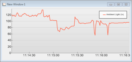
The legend panel
Note that you can thicken the colored line used to symbolize each series with the "color indicator factor" parameter.
Data tracker
The "Data tracker" sub-section enables you to display the value of distinct dots on the graph when you move the mouse cursor near them.
![]()
The data tracker
Navigator
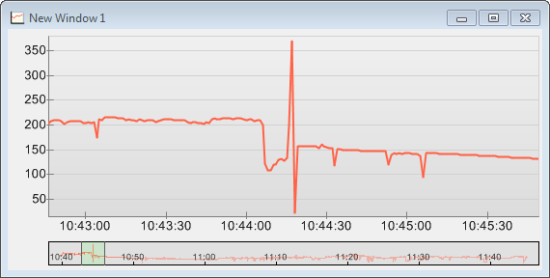
The "Navigator" sub-section enables you to display a small graph with the series of the main graph displayed as a whole, which allows you to easily navigate in the main graph when there is a loss of data or when the zoom level is high.
The navigator
The navigator displays a small colored frame which symbolizes the relative position of the main graph. You can move this frame at will.
Zones on Y axes
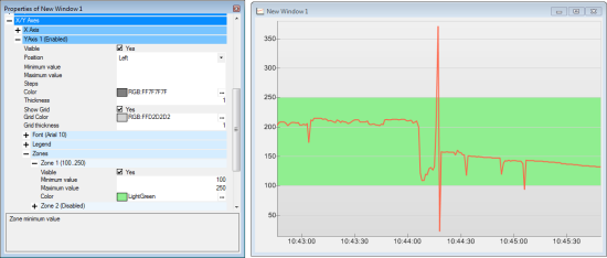
Each graph can define up to three Y axes, available in the "X/Y axes" section. You can assign each data source to any of these Y axes. Each axis can display up to three colored zones to allow you to easily see whether the values of your sensors stay within your predefined limits.
Defining colored zones on the Y axes
Markers
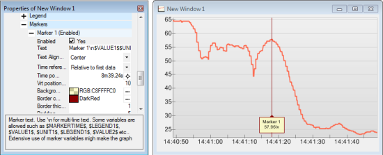
One can place markers on the graph. Markers can be used to highlight remarkable data. They are anchored on the X axis. Their position can be either absolute or relative to the time-stamp of the first data point. Markers can be placed with the contextual menu or the properties editor: they are defined in the X/Y axes / X Axis / Markers section.
Markers
Markers text can be multi-line (use "\n") and can contain some variables:
- $MARKETIME$: Marker timestamp
- $LEGENDx$: legend for serie x (ex: $LEGEND1$)
- $VALUEx$: value for serie x at marker position (ex: $VALUE1$)
- $UNITx$: unit serie x (ex: $UNIT1$)
Variables rendering can use significant resources, don't surprised to experience some rendering lag when using a lot of variables in markers text.
You can define up to eight markers per graph.
Angular gauge
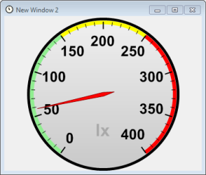
Yocto-Visualization enables you to display sensor data as traditional angular gauges. The selection of the data source works in the same way as for the graphs. The Angular gauges offer, like for the graphs, up to three colored zones. You can configure the color, the width, and even the radius of these zones. The other parameters are rather trivial, the best thing to do is to play with them to understand their respective impacts.
Angular gauges
About units
The Yocto-Visualization widgets automatically retrieve the units of the Yoctopuce sensors for display. If you wan to change a measuring unit used in Yocto-Visualization, you must modify the configuration of the corresponding Yoctopuce module. Note that not all Yoctopuce modules allow you to change their measuring units. Refer to the documentation of the corresponding module for more information.
Solid gauge
Solid gauges are another kind of dial with a slightly more modern look than a simple clock, but they work nearly in the same way as the angular gauges described in the previous paragraph. However, you can modify their geometry:

Solid gauges and their variable geometry
You can change the gauge fill color depending on the value of the sensor by defining one color for the minimal value and a second one for the maximal value. The final filling color will have an intermediate shade proportional to the sensor value. Default colors are green and red.
Digital display
Digital displays are the simplest of the widgets provided in Yocto-Visualization: they simply display the value of the sensors in text mode.
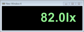
Digital widgets
You can make the text color change depending on the value of the sensor. You must simply define an interval of valid values in the "Range control" section. The other parameters are easy to grasp.
Annotations
Annotations are available for all widgets. Thanks to them, one can place arbitrary texts on one's widgets. These texts can include some variables, which are replaced at display time:
- $DAY$ : day in the current month
- $MONTH$ : current month
- $YEAR$ : current year
- $HOUR$ : current hour
- $MINUTE$ : elapsed minutes since the begin of current hour
- $SECOND$ : elapsed seconds since the begin of current minute
- $NAME$ : sensor name
- $AVGVALUE$ : last average value measured by the sensor
- $MINVALUE$ : last maximum value measured by the sensor
- $MAXVALUE$ : last minimum value measured by the sensor
- $UNIT$ : sensor measure unit
Sensor related variables are slightly different for graphs:
- $NAME1$, $AVGVALUE1$, $MINVALUE1$, $MAXVALUE1$, $UNIT1$ : for the first series
- $NAME2$, $AVGVALUE2$, $MINVALUE2$, $MAXVALUE2$, $UNIT2$ : for the second series
- and so on...
Beware, variables values are computed during each widget refresh, and widget refreshes are driven by sensor refresh rate. For instance: if you are using an annotation to display the current time, but sensor refresh is only 4/min, the time in the annotation will be updated automatically every 15 seconds only.
Overlap
Annotations features two display modes: overlap and non-overlap
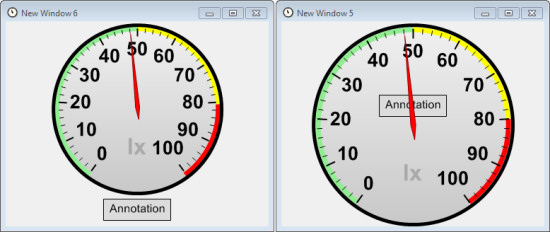
Non overlap vs Overlap
With overlap activated, annotation is shown over the widget contents. Main anchor point are the sides, the corners and the center of the window. Annotation position can also be slightly shifted with the "X offset" and "Y offset" parameters. These offset values are a percentage of the remaining free space.
In "non overlap" mode the widget contents is squeezed to make space for the annotation. In that mode "X offset" and "Y offset" parameters are ignored and the annotations cannot be placed in the window center.
Long story short, annotations are more that just a way to add a title, when used with some imagination they offer some interesting ways to present textual extra information.
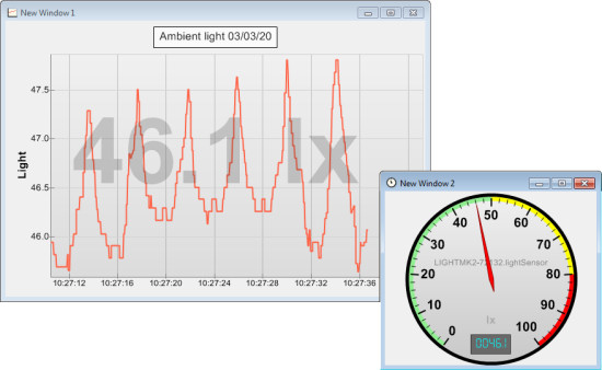
Annotations offer many presentation possibilities
Alarms
Yocto-Visualization allows you to associate two alarms per sensor. These alarms are triggered when the sensor value reaches a predefined condition.
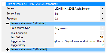
Alarms
An alarm is a system command which is run as soon as the alarm condition is met. The triggering condition is a simple comparison with the value of the "test value" parameter. The system command to be run can contain variables which are replaced by their respective value when running.
These variables are:
- $SENSORVALUE$: the value of the sensor when the alarm is triggered
- $HWDID$: the hardware ID of the sensor (serial # , dot, function name)
- $NAME$: the sensor "friendly name"
- $CONDITION$: the conditional operator used to define the alarm
- $TRIGGER$: the value used to define the alarm
- $DATATYPE$: the value type used to trigger the alarm (average value, minimum value, maximum value)
- $NOW$: the time when the alarm was triggered
Here is an alarm command using Python to beep:
python -c "import winsound;winsound.Beep(1000,1000);"
Here is a command which uses "Microsoft HTML Application Host" to display a message on screen. Note the use of variables in the message.
mshta "javascript:var sh=new ActiveXObject( 'WScript.Shell' ); sh.Popup( 'sensor $NAME$ $CONDITION$ $TRIGGER$', 10, 'Sensor alarm', 64 );close()"
Here is a command using the Yoctopuce command line API to switch a relay during one second. Note the use of the VirtualHub (-r 127.0.0.1).
YRelay -r 127.0.0.1 any pulse 1000
The "Trigger delay" alarm parameter specifies the minimal delay to be observed between two triggering events of the same alarm. Select this value with care if you don't want to be soon submerged.
Alarm commands are sometimes hard to write correctly the first time round. If your command doesn't seem to work as planned, you can look in the Yocto-Visualization logs to see how it was triggered.
Alarms are specific to the sensors and are executed even if the corresponding sensor is not used in any display. If you come up against a ghost alarm, consult the Yocto-Visualization logs to find its source.
You should be aware that the alarms are not generated by the Yoctopuce modules, but by Yocto-Visualization. If the application stops, there won't be any alarm anymore.
The log window
The log window enables you to observe the behavior of Yocto-Visualization. You can make it pop up by right-clicking on any window in the application and in selecting "Show logs".
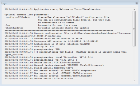
The log window
Logs are particularly helpful in cases where Yocto-Visualization doesn't behave as you expected it. You can find there:
- The version of the different components on the application.
- The location of the configuration file.
- The detection of Yoctopuce modules.
- A record of the triggering of each alarm.
- A record of screen captures.
- Error messages of the Yoctopuce API.
Raw data and exportation
Yocto-Visualization enables you to export the sensor raw data in the CSV format. Select the option "Show raw data" in the welcome window or in the contextual menu and you obtain the "raw data" window.
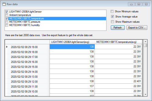
The raw data window
You can select the sensors to be used and export the corresponding data in the file of your choice.
Screen captures
You can take a capture of any widget of Yocto-Visualization. The behavior of the capture system is defined in the global configuration under the "Screen capture" tab.
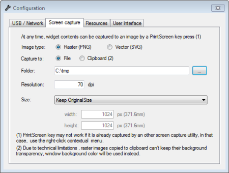
Configuring the screen capture system
You can save screen captures in a file or on the clipboard. You can trigger the screen capture with the contextual menu (option "Snapshot") or the "prtScr" key if Yocto-Visualization succeeded in taking control of this key when starting up.
If needed, you can automatically resize captures to a size better suited to your needs. This resizing is not a simple re-sampling of the image displayed on screen: the whole image is drawn again to the required size.
You can create screen captures in two different formats: PNG which is a bitmap format and SVG which is a vectorial format. The advantage of the vectorial format is that you can resize it without quality loss. Because of technical limitations of the SVG format, the result of both formats can slightly differ, in particular in terms of size and text alignment.
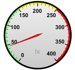
Left, a PNG export. Right, an SVG export. Zoom in a lot to see the difference.
Note that you can very well export the content of a widget in an SVG file, and then edit this SVG file with a vectorial drawing software such as Inkscape to make all the changes that you see fit.
Saving the configuration
By default, Yocto-Visualization automatically saves its configuration when it closes. You can force a save operation from the contextual menu of the application (right-click / "Save now"). The default location of the configuration file is:
- Under Windows:
C:\Users\username\AppData\Roaming\Yoctopuce\YoctoVisualization\2.0.xxxx.0 - Under Linux:
/home/username/.config/Yoctopuce/YoctoVisualization/2.0.xxxx.0
The configuration file is an XML file with a rather explicit content. You can easily generate it automatically if need be. You can run Yocto-Visualization with an alternative configuration file. For example, here is the Windows command line to run it with a config.xml file stored in C:\tmp
YoctoVisualization.exe -config "C:\tmp\config.xml"
If the file given in parameter doesn't exist, it is automatically created.
Monitoring third-party experiments
You can very well use Yocto-Visualization to monitor a third-party experiment. Yocto-Visualization only reads sensors. You can therefore write the code generating an experiment in the language of your choice, and monitor the results with Yocto-Visualization. Simply make sure that:
- The experiment code and Yocto-Visualization both use a VirtualHub to communicate with the Yoctopuce modules. If one of them uses native USB access, the other one won't be able to run.
- You should not modify the "frequency" and "recording" parameters in Yocto-Visualization as they directly act on the physical configuration of the modules and can therefore modify the behavior of all the application which uses these modules.
Compatibility
The Yocto-Visualization application is essentially based on the YSensor class. Therefore, it is compatible with all Yoctopuce sensors, passed, present, and future. However, if you use an old module found in the bottom of a drawer, make sure that the firmware version is at least 31735.
Limitations
Nothing is truly magical in the real world. Yocto-Visualization is no exception to the rule and suffers from a few limitations.
Sensors only
Yocto-Visualization manages only sensors. It doesn't monitor actuators, such as relays, electric outputs, servo controllers, and so on. The anButton function, present on modules such as the Yocto-Knob or the Yocto-(Maxi)Display, is not a sensor from the Yoctopuce API standpoint, thus Yocto-Visualization can't monitor it either.
Memory resources
We optimized Yocto-Visualization so that it can manage up to one million measures without slowing down noticeably, but to do so it uses a significant amount of memory. This can be an issue for some baby-computers such as the Raspberry Pi. Therefore, you can limit the number of measures memorized in the global configuration window, under the "Memory usage" tab. When the limit is reached, Yocto-Visualization begins to "forget" the oldest measures. By default, there is no defined limit but be aware that if you let the application run without limits for long enough, it will run out of memory and crash, whatever the memory resources of your computer.
Touch screens
Touch screen management is rather limited: there is no multi-touch management. However, you can configure the application so that a vertical drag drives the zoom level in the graphs and a double tap calls the contextual menu. These parameters are defined in the global configuration windows, in the "User interface" tab.
Number of series per graph
The maximum number of series per graph is limited to 4. You can increase this limit rather easily, but this requires you to recompile the application.
Source code
The full source code of Yocto-Visualization is available on gitHub at the github.com/yoctopuce/Yocto-Visualization address. In accordance with Yoctopuce general conditions, you can do whatever you want with it, as long as you interface Yoctopuce modules.
The Windows XP case
Yocto-Visualization takes advantages of a few optimizations available only since the .NET 4.5 framework, therefore it is available precompiled for this framework which is unfortunately unavailable on Windows XP. However, you can recompile the application for framework 3.5 at the cost of a slight loss in performances.
Conclusion
This rather exhaustive post is particularly lengthy, but if you have questions about Yocto-Visualization, don't hesitate to ask them: we'll update the post accordingly, even if it makes it even longer :-)
Edit: A Web version of Yocto-Visualization is available.


